13 Typography Inspired Trends in Packaging
A word to the wise: your typography is equally as important as your graphic design. Pro font designers, Fontfabric Type Foundry, share some head-turning typography inspired trends in packaging.
By Guest Author — 17 December, 2020
2020 got us double-checking our future plans and let’s be honest, it hasn’t been easy to recalibrate. However, somewhere between lockdowns and general chaos, brands emerged with some head-turning packaging designs once again.
So instead of wishing for a more forgiving 2021, we should all focus on the benefits of creative constraints and learn from the current trends.
Buckle up and join us while we outline some solid strategies to apply in your own designs. In addition, you’ll master successful typography techniques as advised by pro font designers from Fontfabric Type Foundry.
Here are 13 typography inspired trends in packaging from 2020:
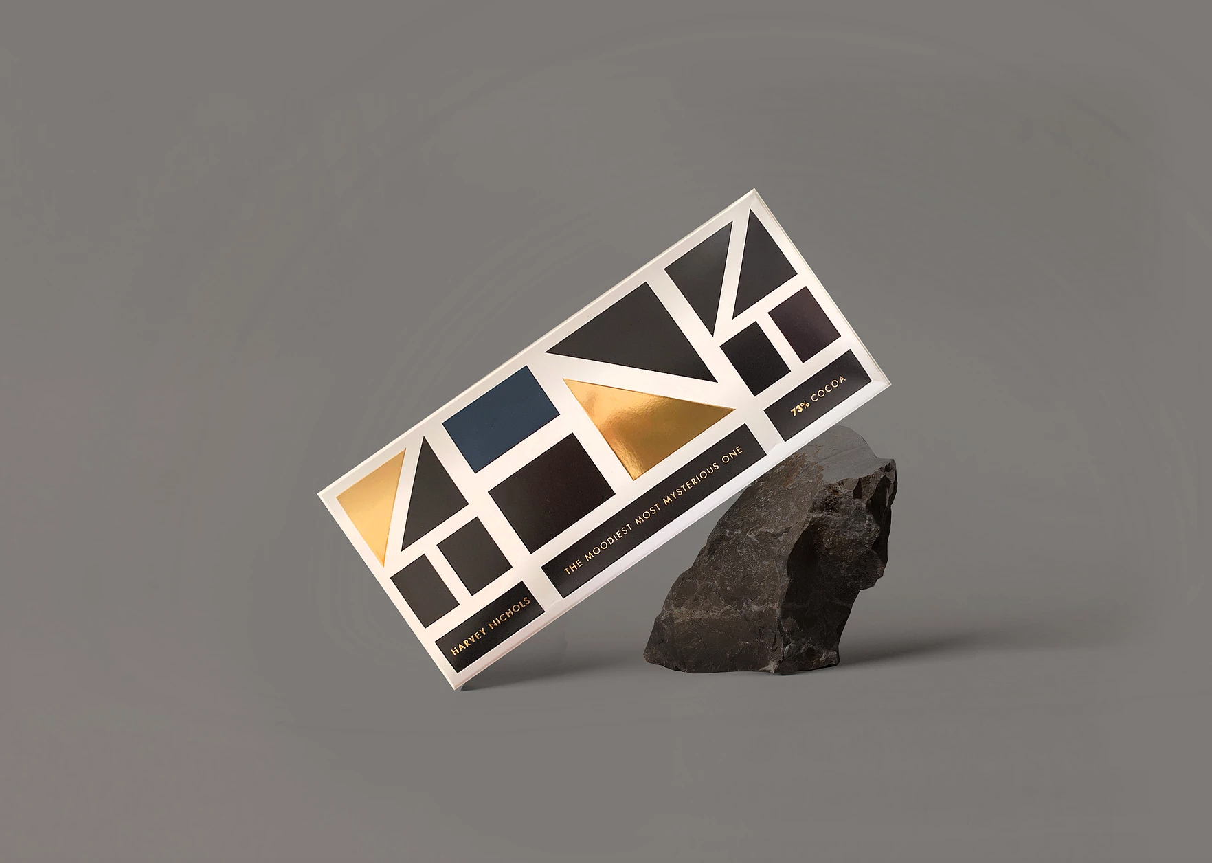
Geometric power: basic shapes that speak to the Swiss in you
Characterized by the usage of simple constructive elements (like circles, triangles, and squares), the geometric packaging designs of this year feature both filled and linear shapes. Leaning towards the abstract these designs are a smart way for brands to make a statement and get their message through.
The mixture of basic shapes achieves a clean sharp look that uses perspective as a powerful attention-grabbing tool. Precise lines contribute to minimal and more complex designs alike, allowing your typography to do its job without any distractions.
Pro Typography Tip: Aim for simple geometrical fonts. Choosing a geometric sans typeface is a surefire way to keep the cutting edge feel of your packaging design.
Retro vibes: it only takes one look to take you back
It’s no secret that the 20th century continues to fascinate and inspire modern designs. Working with emotions such as melancholy, nostalgia and pure curiosity is a proven strategy from which brands benefit on many levels.
2020 packaging designs strike a chord through authenticity and leave you with the impression you’ve just opened a sealed time capsule. 2 creative directions stood out this year:
- Packaging inspired by the American ad culture featuring a lot of textures and detailed illustrations from the first half of the 20th century. These designs tend to use natural colors and depend on popping typefaces to grab your attention. Pro Typography Tip: Complement your retro designs with a strong typeface like a Bold Condensed sans serif, script, or a slab serif. Anything that achieves the distinctive aesthetic as if products are shouting “Look at me and buy me!”
- Packaging designs that show incredibly skillful font pairing and play around with the unmistakable characters of various typefaces. Pro Typography Tip: When tackling this creative direction you’ll want to choose one or two main players in the composition. These should be display typefaces with a strong memorable design. They are usually set in larger sizes. After that build your composition by using more ubiquitous fonts, like sans serifs for example
Futuristic energy: gravity-defying designs to make you switch dimensions
Remember the excitement right before your favorite video arcade game fired up? And you found yourself teleported into a pixelated universe of vivid colors and jumpy characters? Well, even if you weren’t around in the golden era of the 80s cosmic-inspired gaming culture, the fascination with outer space has made a strong comeback in the packaging industry in 2020.
This year’s futuristic designs carry a clean modern look with a splash of retro gaming elements – expressive popping colors, bold typography, and extra type treatments. Neon effects and gradients intertwine to complete any user’s journey into the vast unknown.
Pro Typography Tip: You can mix the typography with gradients, perspective effects, or even opt for using a pixel font. Nothing’s too colorful. The trick is to have one main typeface which compliments the visual. Don’t go too far with the mixing of various styles, though.

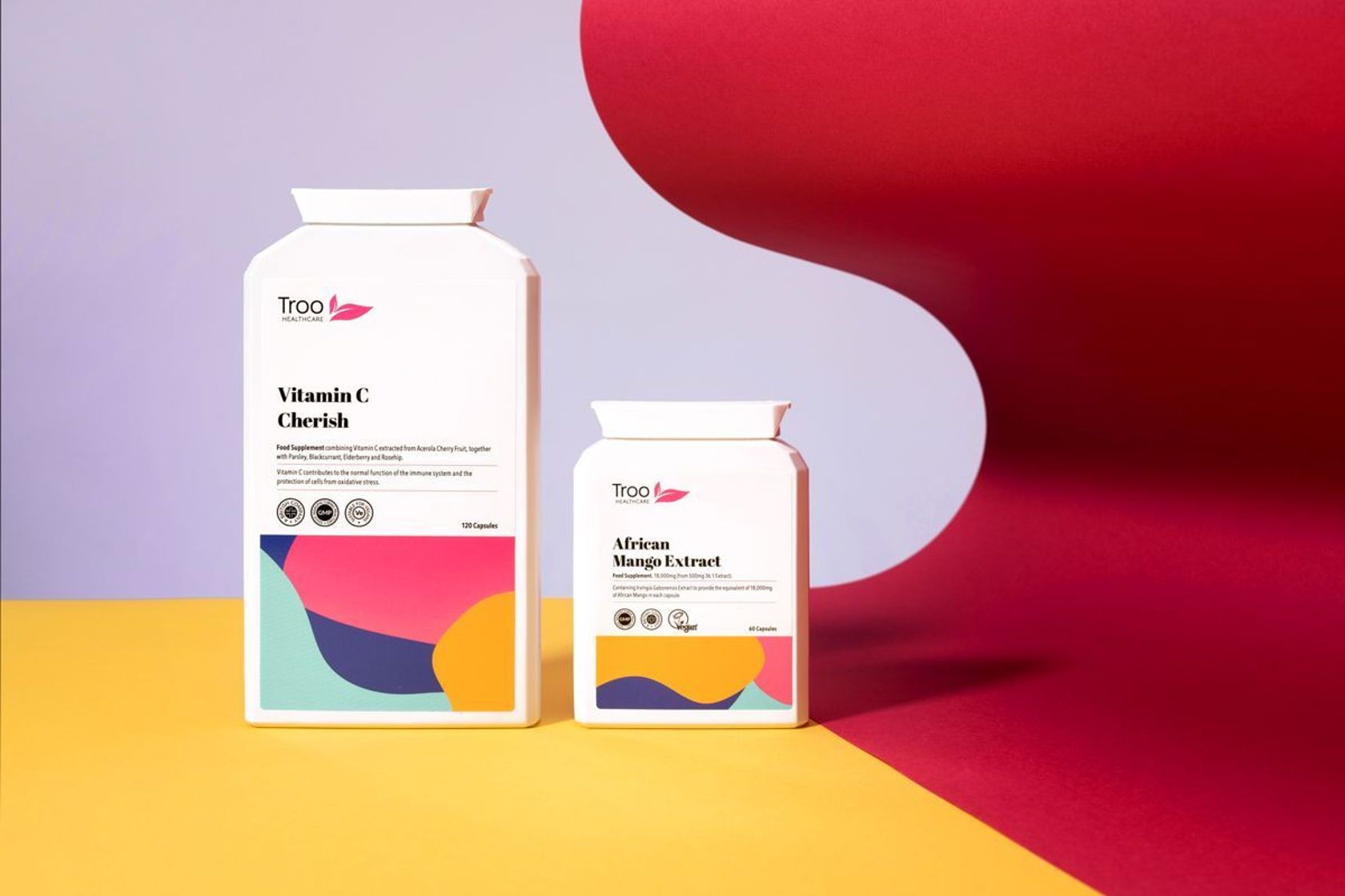
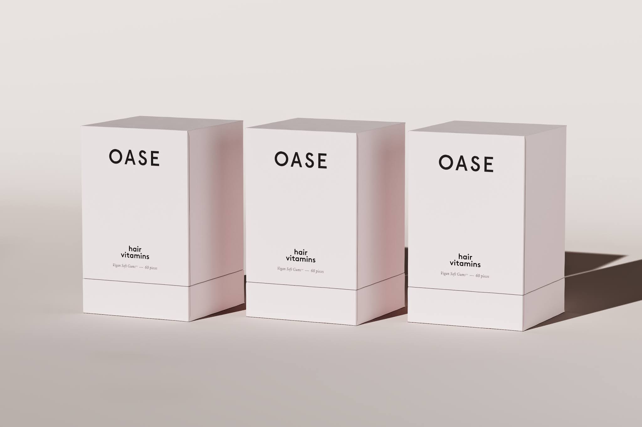
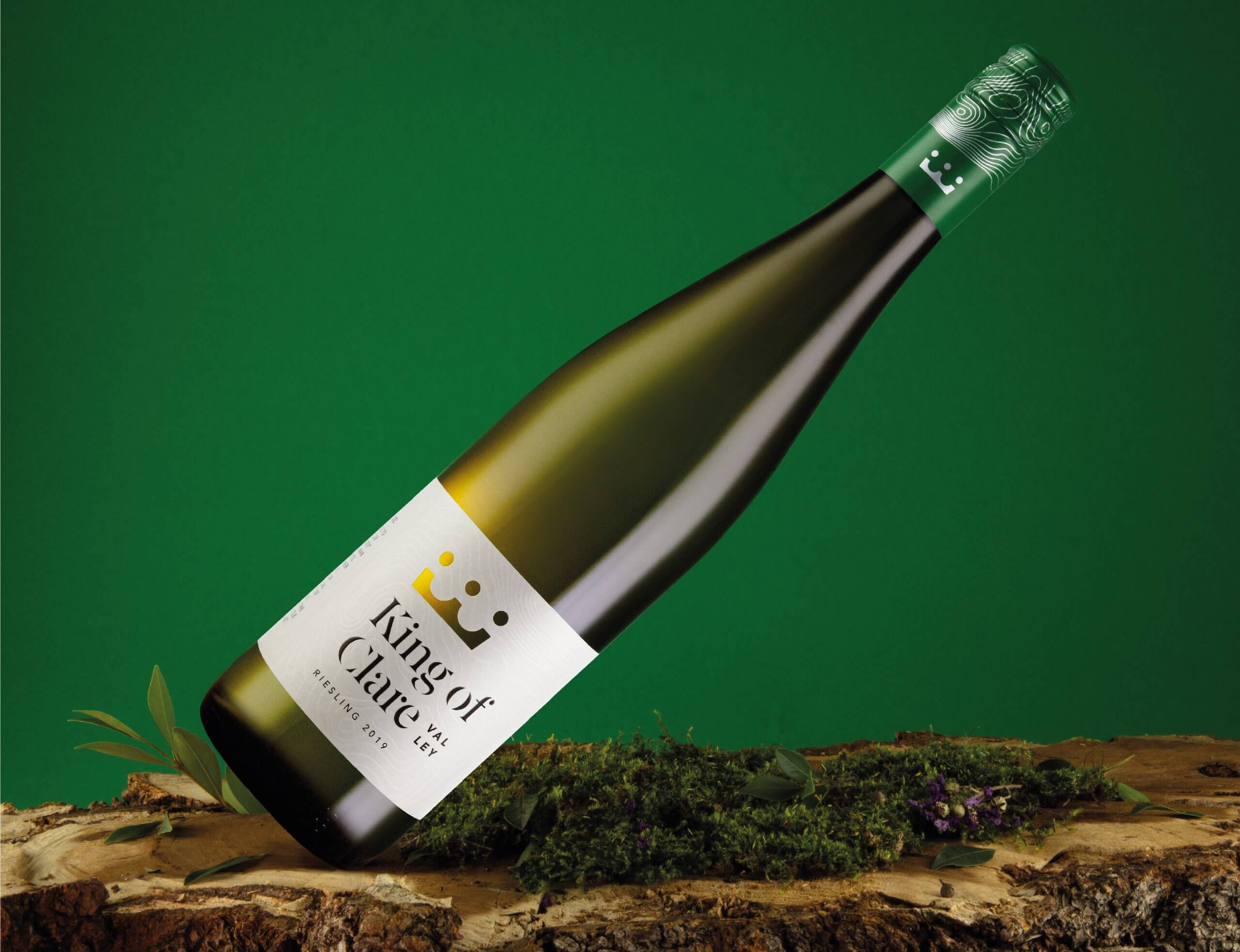
Minimalistic approach: packaging that’s worthy of your interior
More of an iconic creative direction than a trendy one by now, minimalistic designs have a special place in this year’s selection. These packaging concepts often use images and graphic design elements, mainly text on solid or minimally-treated backgrounds.
The designs stand out with a lot of “white space”, their compositions featuring plenty of breathing room between elements for a classy modern finish. Matted colors and clean typography choices are prevalent. It has truly turned into a popular sign for high-quality luxurious products. And as of 2020 for more affordable ones too!
Pro Typography Tip: Go with clean layouts, a minimal color palette, and a maximum of two simple typefaces. Make sure to leave a lot of white space. Sans serifs are kings in this category.
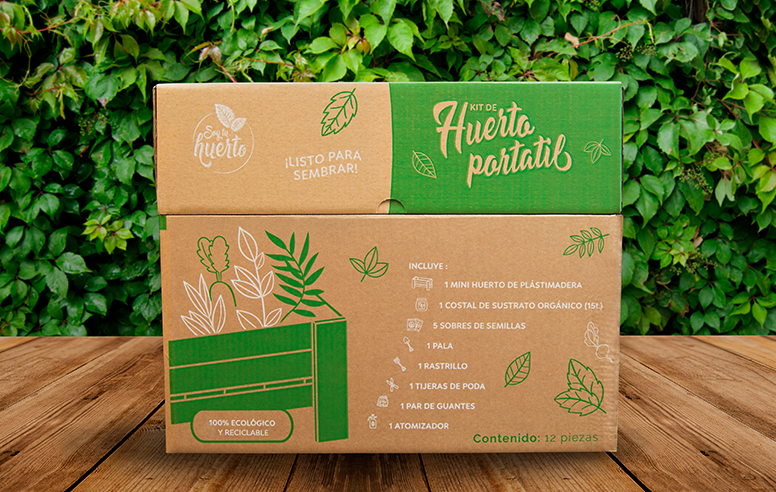
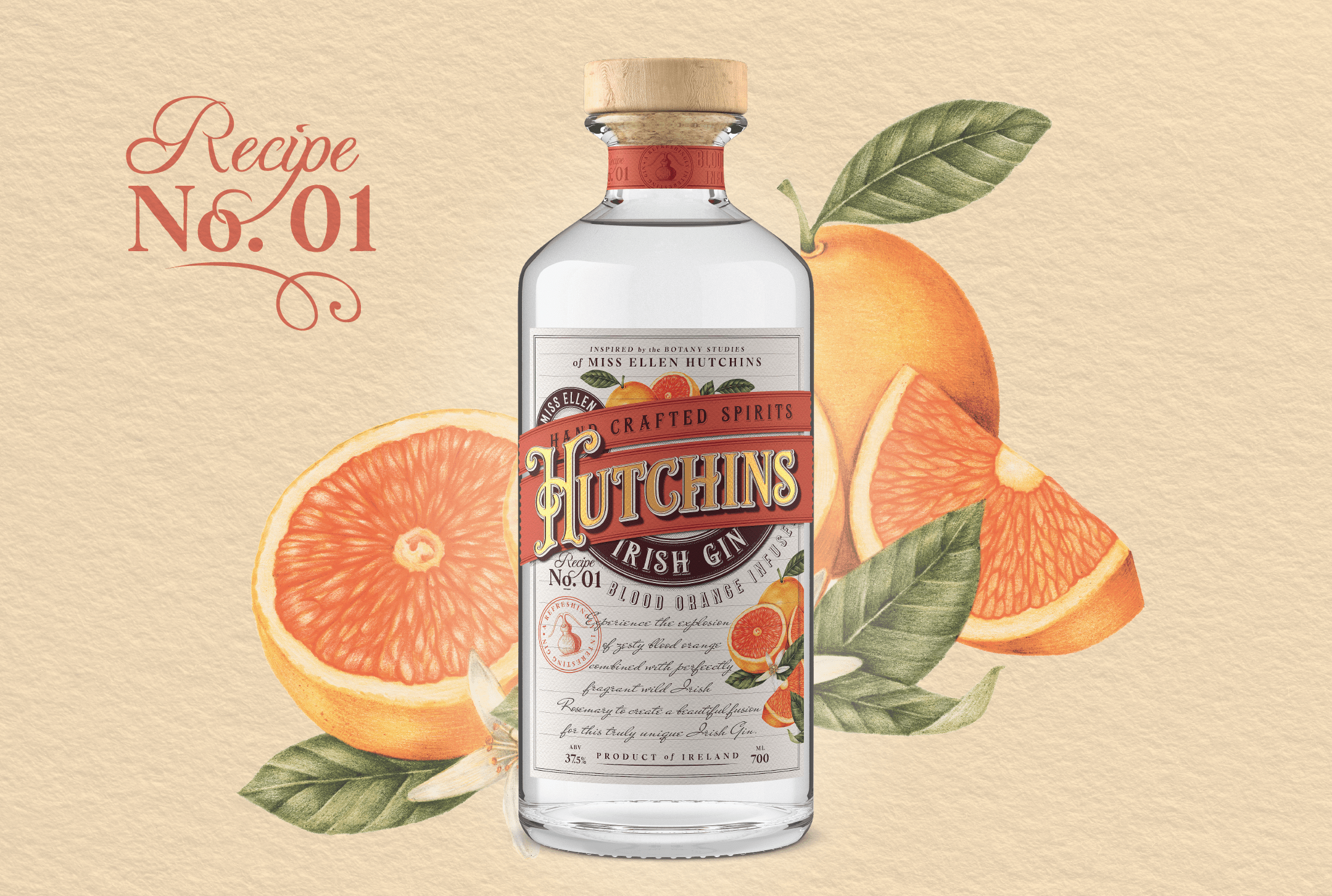
Nature-inspired: clear messages that make you give back to the world
It’s only natural (pun intended) to outline eco-friendly packaging as a stand-alone trend for 2020. Brands are going above and beyond to achieve nature-inspired designs featuring earthy colors, organic textures, and a general handmade feel.
These designs aim for a full immersion into the origins of the product leaving you with a sense of a meaningful investment—in your own health and the well-being of the Earth. Products inspired and developed locally drawing from the best within a region have earned a distinct spot in this category for 2020.
Pro Typography Tip: Explore typefaces that will contribute to the handmade feel of the design – hand-crafted typography, scripts, and textured fonts are your trustworthy options here.
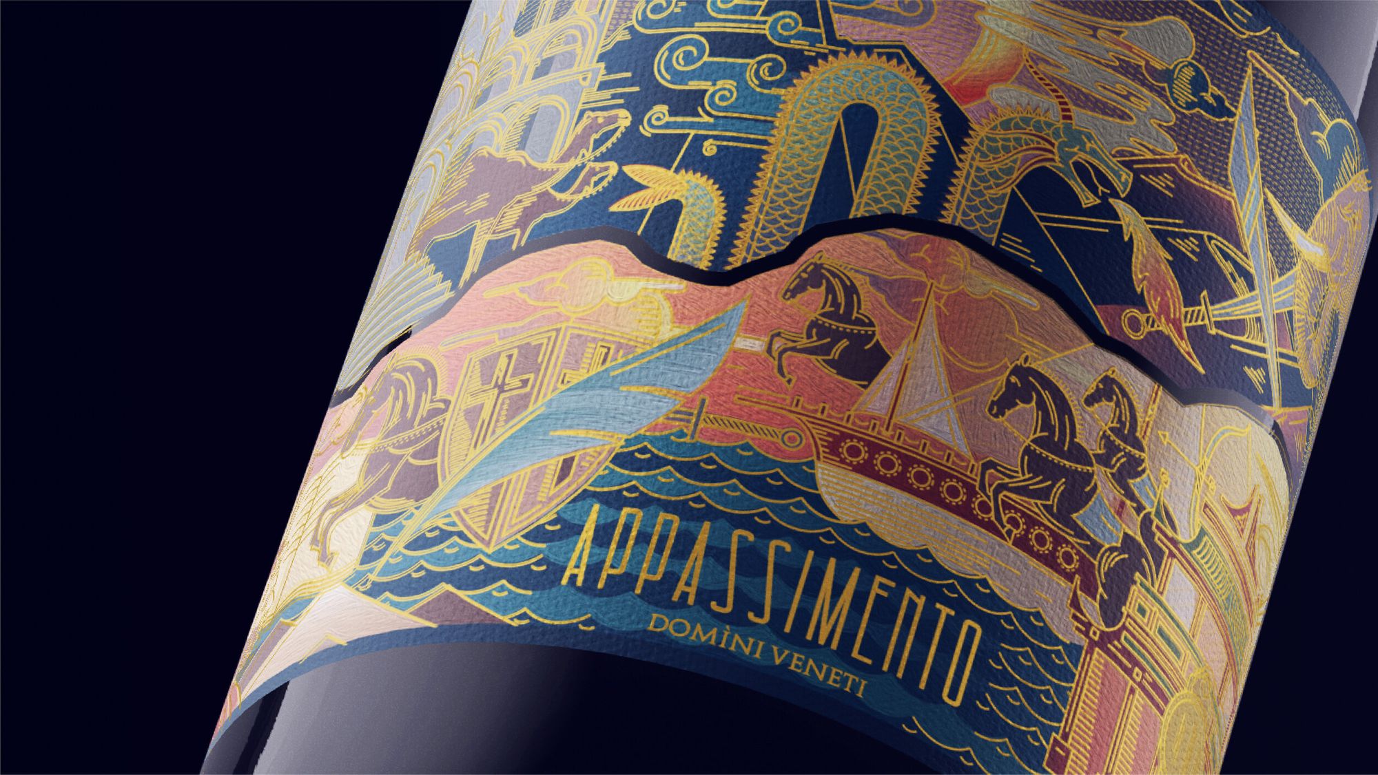
Fine artistry: illustrations to make your typography sing
In the last years, the integration of more illustrative work has been on the rise. What makes the movement stand out in 2020 is the ever-growing intricacy of images that look and feel more artsy than commercially graphic.
Fine details, rich colors, and complex compositions nestle as if framed by the product itself. These designs translate true craftsmanship into an attention-grabbing tool, only to navigate you to the brand’s equally captivating message.
Pro Typography Tip: Use typefaces that stand out, but don’t steal the show. Display typefaces are a good choice. In any case, make sure to weave your typography into the entire composition, so it doesn’t feel foreign to the illustrative work.
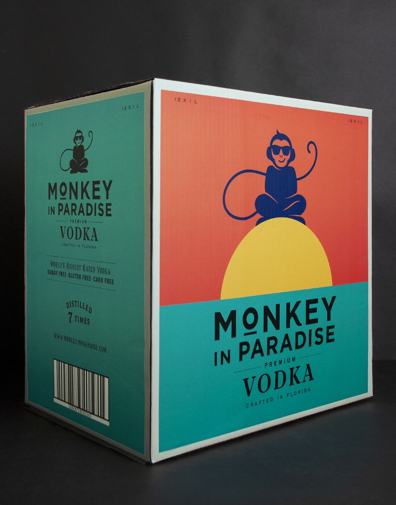
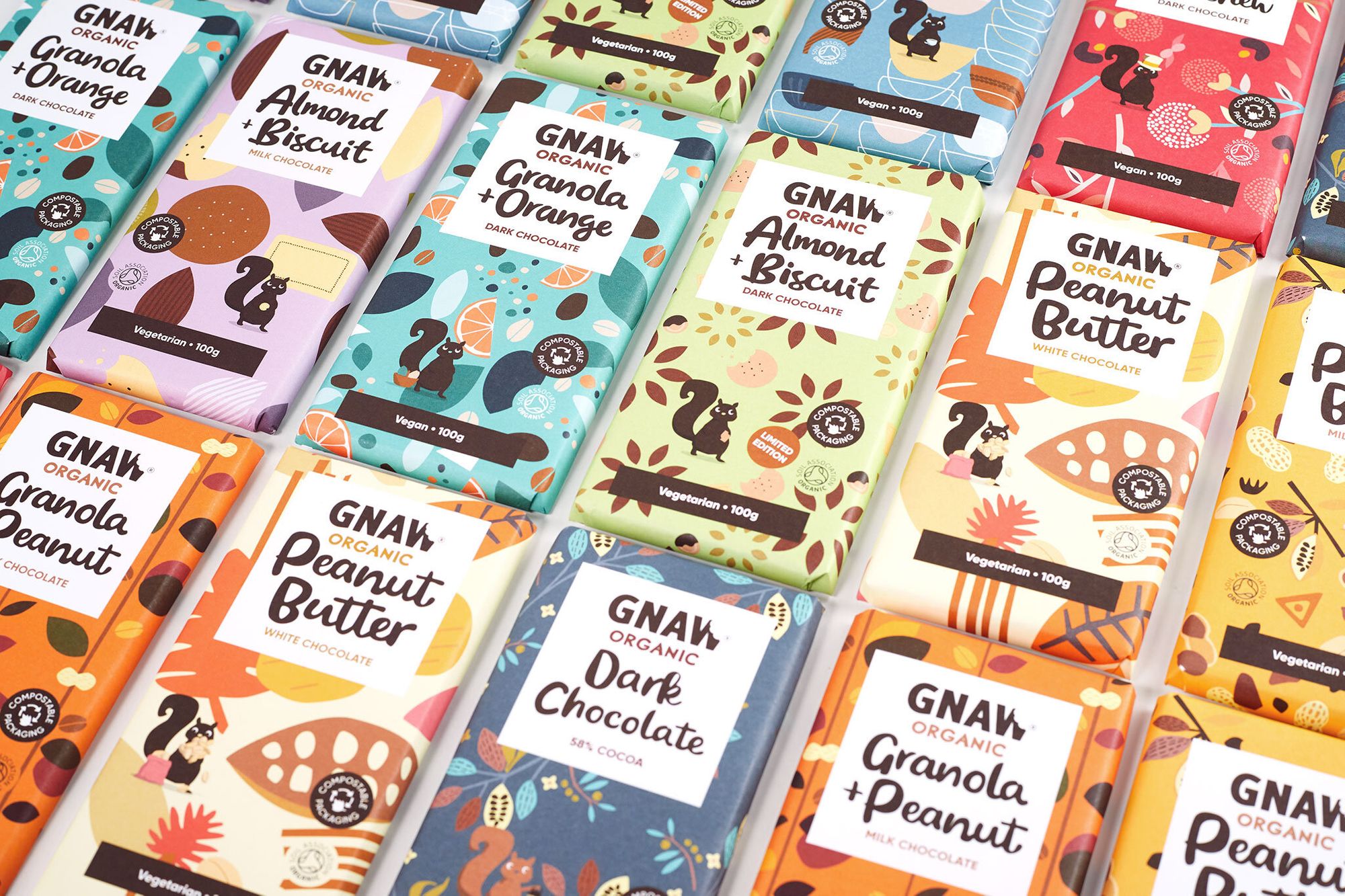
Fonts in flat design: complementing, yet not stealing the show
It’s no secret every year attempts to perplex us with total opposites. 2020 makes no exception. Clean flat illustrations look undeniably good in packaging designs and have won their place in the selection fair and square.
These designs stand out with bold colors, satisfying compositions, and a special stylistic which requires a drastically different approach as opposed to the intricate fine art illustrations from the previous category. Flat designs call for clean typography choices that add to the overall experience of a simplistic, yet impactful packaging.
Pro Typography Tip: When going for a flat look the usual suspects will be fonts with simpler visual forms—sans serifs. Could be a serif typeface as well but a simpler one. Do not use shadows, engraving effects, or anything too complicated as type treatment.
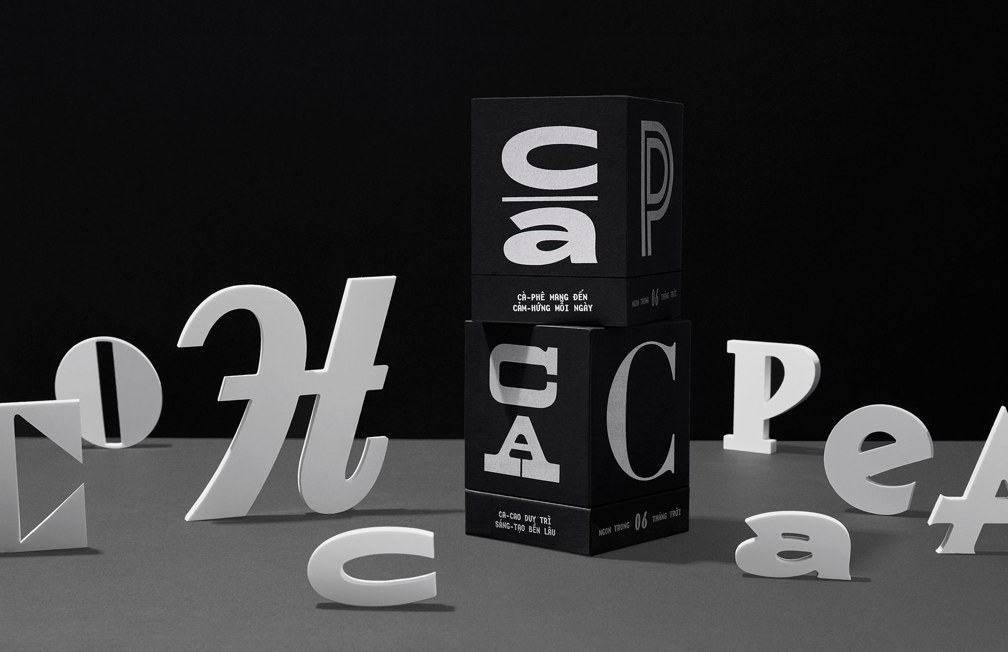
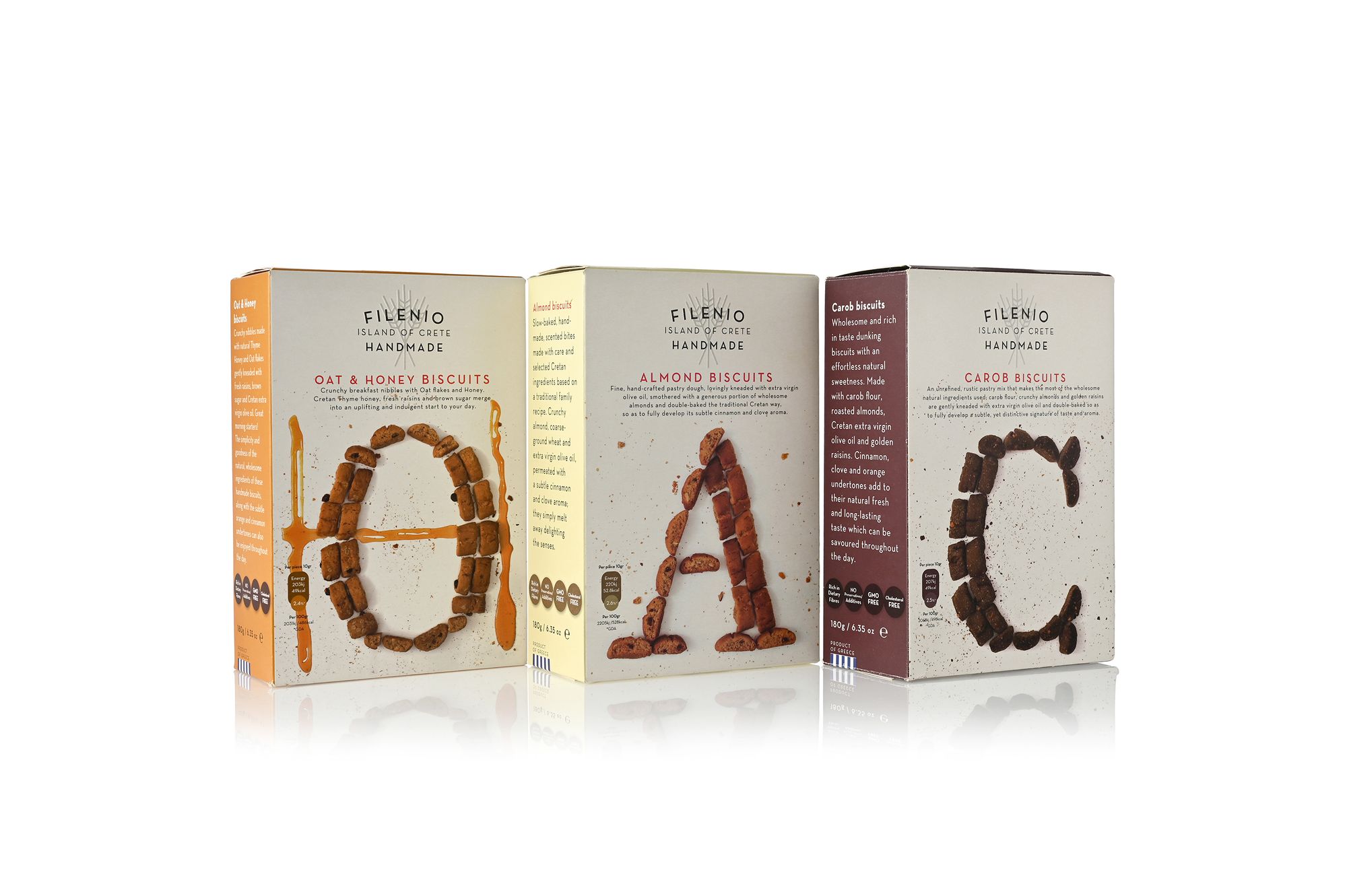
Type takeover: let letters do all the work
Typography can make or break a design project, and packaging makes no exception. In 2020 multidisciplinary designers took letters to the forefront in their visual identity concepts. These designs are bold, blunt, and brilliant.
What makes them stand out is their forthright compositions using the whole surface of the product, experimental fonts on solid backgrounds, and loads of lettering artistry. There’s no mistake in what the product represents. The typography is not only “saying” it but is also translating the brand’s general aesthetic.
Pro Typography Tip: Be brave and experiment with your typography choices. Feel free to break some rules and even go with some unorthodox fonts and type compositions. The important thing will be to communicate your idea in a clear way. Don’t forget the context of the design!
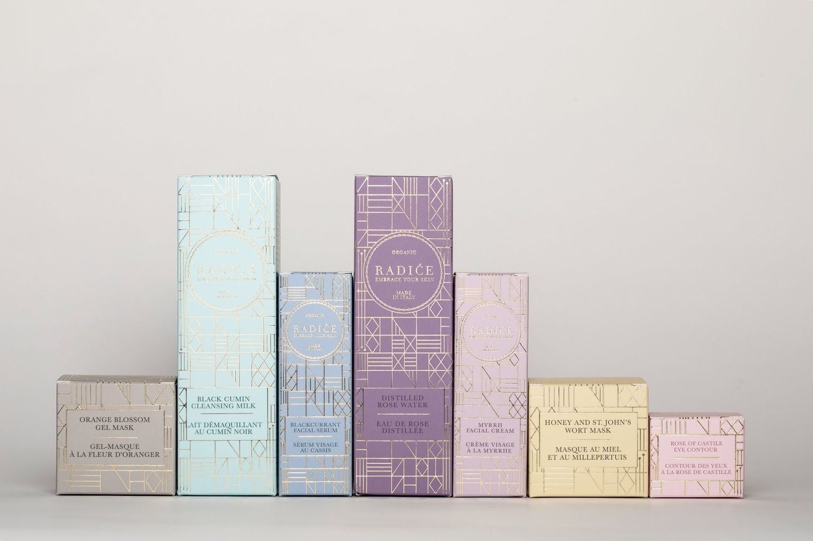
Font pairing mastery: maximum efforts for maximum results
For years now the spirits industry has been the fountain of inspirational packaging designs. And a personal favorite to type creators and font admirers. Complex compositions, luxurious manufacturing techniques, and jaw-dropping ornamental work are overwhelming our senses—always in a good way of course.
2020 designs stay true to the traditional font pairing masterpieces and the classic serif solutions. However, modern manufacturing leaves us doubtless that the final product belongs on our shelves at home even right now. No rusty and dusty first impression over here.
Pro Typography Tip: Aim for a classical feel combined with expensive print materials and techniques. Up your decorative game, as it comes quite handy.
Serif comeback: the star guest that makes you go “Woo-hoo!”
It’s been a long time coming to see brands use serifs as main players in their visual identities and 2020 has been truly joyous. As professional type designers, we’ve been observing a steady increase in the font interests of the design community towards serifs.
The former bookish favorites are now boldly laid out as full-fledged display fonts and our guess is—they are here to stay! Check out some of the best for 2020.
Pro Typography Tip: Choose a serif typeface that has what it takes to stand out. Strong asymmetrical details in the bigger sizes are something to look for. Getting noticed is a good thing!

See-through typography: adding a twist to your brand’s transparency
There have been some pretty clever see-through packaging designs over the last few years. And 2020 welcomes a well-implemented idea with open arms.
The food and beverages brands put it all on display by hinting at what the product inside looks like. Playing around with negative space and curious compositions has proven a fun challenge for packaging designers aiming to create a new definition for the word transparency.
Pro Typography Tip: If you want to cut out the typography from the package - use stencil fonts. Otherwise, keep the fonts complementary to the visual, and don’t let them steal the show. If the product is shown, let the customer see it.
Handcrafted: nothing like the finish of a stroke to make it unique
In 2020 there’s been a generous amount of packaging designs inspired by analog practices. Products from various industries are benefiting from the unmistakable finish of the human touch.
Calligraphy and lettering artists ink product labels to achieve that signature feel of true craftsmanship. The end result? A product that looks and feels like it was made for you especially.
Pro Typography Tip: If you are not a calligrapher or a lettering artist choose a font that has plenty of alternate letters. OpenType features like contextual alternates and swashes can give a better handmade feel to the design and will help you avoid duplicate letters.
Playful typography: character-driven letters for charming designs
In a time that has “lockdown” declared as word of the year, we’ll take all the color we can get. Playful packaging designs with illustrative characters, a vivid color palette, and modular letters bring an honest smile to your face. Customized display fonts are often the star in these designs contributing to the animated vibe of the products and overall brand aesthetic.
Pro Typography Tip: Sometimes the project requires a more playful approach. Don’t be shy to let the kid inside of you go all experimental. Use a typeface as a base and draw on top of it. It might lead you to some quirky results!
Wrapping it up *some puns never get old*
2020 is all about thinking inside the box. Brands and packaging designers took advantage of creative limitations and turned head-scratchers into impactful products.
Now that you’ve explored the packaging trends of the year and got a sneak peek into effective typography solutions, you’re ready to impress new clients and take 2021 by storm. And remember—every type of project needs a proper type treatment.
So, are you ready to add that extra oomph?
Fontfabric is a digital type foundry that crafts retail fonts and custom typography for various brands. The Fontfabric team is a tight-knit group of accomplished, multidisciplinary designers who share a passion for high-quality typefaces, calligraphy and lettering. For inspiration, give their Behance and Instagram accounts a follow!